
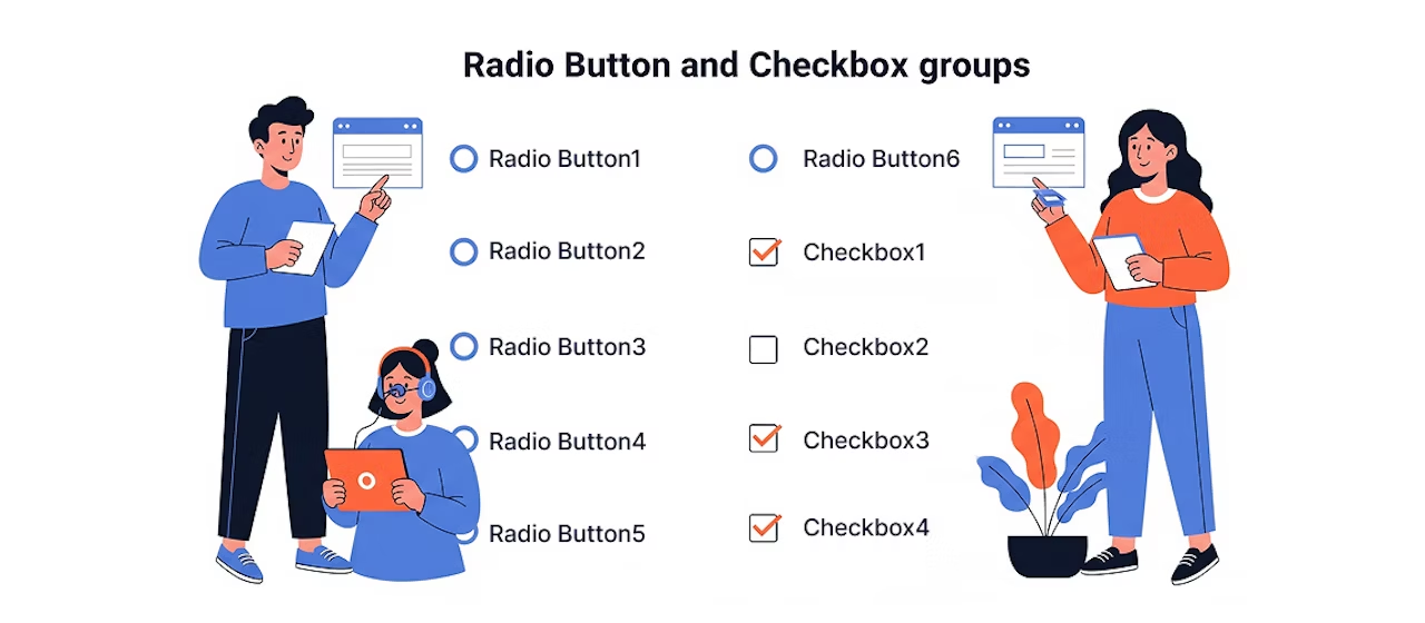
When creating forms, have you ever been uncertain about how to handle label elements for groups of radio buttons or checkboxes? In particular, it can be tricky to know how to label the entire group and how to deal with the for attribute.
This time, we'll organize approaches to labeling these groups and introduce concrete methods.
Common approach and its issues
Pointing for to the first item
For a group of radio buttons or checkboxes, point the <label>for attribute of the <label> element to the first item.
For example, here's what the code looks like.
<div class="form-group">
  <label for="fruit-apple">好きな果物</label>
  <div>
    <label><input type="radio" id="fruit-apple" name="fruit" value="apple">りんご</label>
    <label><input type="radio" name="fruit" value="orange">みかん</label>
    <label><input type="radio" name="fruit" value="banana">バナナ</label>
  </div>
</div>
While it may appear to have no visual issues, screen readers associate the label "favorite fruit" with only the first radio button, so the entire group is not recognized correctly.
omit for
<div class="form-group">
  <label>好きな果物</label>
  <div>
    <label><input type="radio" name="fruit" value="apple">りんご</label>
    <label><input type="radio" name="fruit" value="orange">みかん</label>
    <label><input type="radio" name="fruit" value="banana">バナナ</label>
  </div>
</div>
This approach lacks clarity about which label relates to which element. Particularly for screen reader users, it becomes unclear which option is associated with the label.
A better improvement approach
Group with role attribute and label with aria-labelledby
This method groups radio buttons and checkboxes with role="radiogroup" or role="group", then associates them with a label element by specifying its ID via aria-labelledby. This makes it explicit to screen readers that the label "favorite fruit" applies to the entire group.
Radio buttons
<div class="form-group">
  <span id="fruit-group">好きな果物</span>
  <div>
    <div role="radiogroup" aria-labelledby="fruit-group">
      <label><input type="radio" name="fruit" value="apple">りんご</label>
      <label><input type="radio" name="fruit" value="orange">みかん</label>
      <label><input type="radio" name="fruit" value="banana">バナナ</label>
    </div>
  </div>
</div>
Checkboxes
<div class="form-group">
  <span id="fruit-group">好きな果物</span>
  <div>
    <div role="group" aria-labelledby="fruit-group">
      <label><input type="checkbox" name="fruit" value="apple">りんご</label>
      <label><input type="checkbox" name="fruit" value="orange">みかん</label>
      <label><input type="checkbox" name="fruit" value="banana">バナナ</label>
    </div>
  </div>
</div>
Using <fieldset> and <legend>
Another approach is to use <fieldset> and <legend>. This approach is based on HTML semantics, and the entire group is properly recognized without adding special attributes or roles.
In the example below, a group of radio buttons is wrapped in <fieldset>, and <legend> is used as a label.
Note: There are cases where you might want labels and inputs arranged side-by-side for design purposes. In such cases, you might set fieldset to display: contents;, but in some browsers this causes legend to be removed from the accessibility tree, which is not recommended. We want to avoid situations where forcing layout alignment with CSS compromises accessibility.
<div class="form-group">
  <fieldset>
    <legend>好きな果物</legend>
    <div>
      <label><input type="radio" name="fruit" value="apple">りんご</label>
      <label><input type="radio" name="fruit" value="orange">みかん</label>
      <label><input type="radio" name="fruit" value="banana">バナナ</label>
    </div>
  </fieldset>
</div>
Summary
Labeling groups of radio buttons and checkboxes can be organized as follows.
Using role attribute and aria-labelledby
- Flexible customization available when needed
- Explicitly set group labels combined with role="group"
Using <fieldset> and <legend>
- Standard approach based on semantics
- More robust and accessible implementation possible
- Potential accessibility concerns depending on layout
Depending on design and requirements, either approach can achieve proper accessibility.
Using <fieldset> and <legend> is more semantic, but in contact forms and similar layouts, the role attribute and aria-labelledby approach may be easier to work with depending on the overall structure.
Web accessibility goes deeper than you think!


A "master of technique" who jumped from DTP into the web world and, before he knew it, mastered markup, frontend, direction, and accessibility. Active across multiple domains since Liberogic's early days, he's now a walking encyclopedia within the company. Recently, he's been diving deep into prompt-driven efficiency optimization, wondering "Can we rely more on AI for accessibility compliance?" Both his technology and thinking continue to evolve.
Ayumu Futamata
IAAP Certified Web Accessibility Specialist (WAS) / Markup Engineer / Frontend Engineer / Web Director