
When you're creating design parts in Figma and sharing the work, you might encounter some unexpected issues. Have you ever had trouble with the color of a component icon not changing properly?
In this article, we will clearly explain the cause and solution to the problem of icon instance colors not being reflected, which many Figma users face.

My senior colleague has turned the button I created into a component!! What's more, you can even change the icon part!! That's amazing! But there aren't enough icons, so I'm going to keep registering icons as components and make it an easy-to-use component!
I quietly created a bunch of icons.

Huh? The icon components aren't switching properly? I'm sure I'm making them the same way as my senior... Why aren't the colors switching properly?

That's because of the way you make your icons!

Senpai! How do I get it to change color?

Well, that's great! I'll teach you the secret to switching icons in Figma. Make sure to take notes and memorize them!

Yes! I'll try my best to remember it!
Why are colors inherited? How Figma overrides work
When creating a button in Figma, it is common to set the icon to be changeable via instance properties. However, when switching icons, problems often occur, such as the color not being reflected or changing automatically.
When you switch icons in Figma,The color I set is not reflected/the color does not changeHave you ever encountered the above problem? In this article, we will explain the causes and solutions in an easy-to-understand manner.
Make sure to check the settings on the icon and button side to ensure that the color changes properly when you switch icons.
First, check the structure of the button component
First, let's look at how colors are overridden using the following structure:
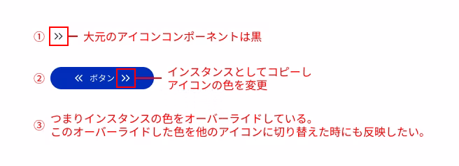
① The original icon component is black
② Copy it as an instance into the button and override only the color
3. If you switch to another icon in this state, the icon color may revert to the default color instead of white.
Tip: Understand the relationship between master components and overrides
The most basic thing to note is that any properties you override will no longer reflect changes made in the master component.
The overridden part: If you change the color or text in an instance, that part becomes independent. If you later change the same part in the master component, it will not be applied to the instance. Overrides (fill, stroke color, text, etc.) take priority.
Parts that are not overridden: Properties that you haven't changed (e.g. padding and margin) will reflect the changes made in the master component.
Be especially careful if you change the layer structure of your master component: if you rename a layer or delete a layer and add a new one, Figma may recognize it as a different element and reset the instance overrides.
With the above in mind, let's look into why the icon color won't change.
Cause 1: Fill and Stroke settings are mixed
Even if the icons look the same at first glance, the "Fill" and "Stroke" are treated as completely separate properties in Figma. Therefore, if you switch from an icon expressed using a fill to an icon drawn with a stroke thickness, the color override may not be reflected correctly.
example:
Icon A

Icon B
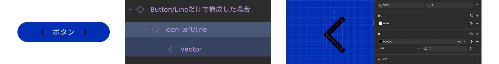
- Icon A: An outlined icon with a fill.
- Icon B: An icon outlined with a line (Stroke)
In this way, if the icon is drawn differently, the result of applying the color will also change,It is important to keep the expression consistentWhen you click on Icon B, the Fill is set to white, but since this icon component is only constructed with lines, the color is not replaced. However, the fill is actually properly set to white (though since there is no fill element, the white has nowhere to go...).
✅ Solution:
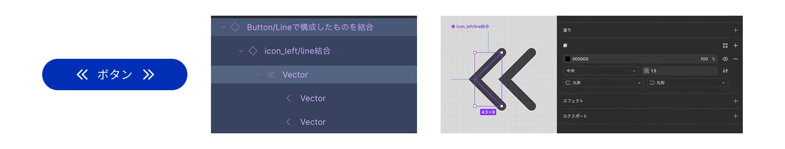
The rule is to create all icons with a "fill" effect. Icons drawn with lines must be converted to outlines (command+shift+O) to convert it into a "paint" object. This has the advantage of making it easier to handle when implementing.
In our case, when we implement it, we put the SVG path into a CSS variable or incorporate it with Astro Icon, so everything is uniformly painted.
If you leave it as a Stroke, the line thickness will change when you scale the icon, which can cause the design to fall apart. Unless there's a special reason, it's best to outline it and use a consistent "Fill" setting!
If you create an icon using only lines, the line size will remain the same when you scale the icon. This isn't a problem for simple paths like arrows, but for more complex icons, 12px will make them look squashed, and 80px will often make them look stretched out.

Icons constructed with lines are best outlined because the line thickness does not change when resized. If you want to keep the original data before outlining, keep the original data near the component.
When you combine something created with a Stroke, it will be changed to a Fill, but even in this case, problems often occur, such as only one part of the shape not changing in size.
Cause 2: Layer names do not match
In Figma, componentsWhen switching instances, styles and properties are inherited for elements with the same layer name.There is a specification that says:
example:
Icon A

Icon B

- Icon A vector layer name:
Vector - Icon B vector layer name:
Vector2
If the layer names are different like this, Figma will think they are "different" and the overridden styles will not be applied properly.
✅ Solution: Unify the layer names used in the icons (e.g., AllVector)
For now, let's make sure that all the layer names for the paths you want to color are the same!
Cause 3: Different layer structures (hierarchies)
Even if you unify the layer names, the switching may not work properly. In that case, it may be related to differences in the layer structure.If the number of layers or structure differs, properties may not be mapped correctly..however,In some cases, slight differences in hierarchy are not a problem if the layer names are the same.。
example:
Icon A

Icon B

Icon C

- Icon A is "Vector
(path)" Outline and combine into one vector (basic icon) - Icon B is "Flame
(Flame)> Vector(path)" → OK (The color is inherited to the path name "Vector") - Icon C is "Vector
(Flame)> Flame(path)" structure → NG (the color change set in the flame name "Vector" appears)
In this way, the layer name "In a structure where "Vector" contains a group, you need to be careful about how you apply the style.Also, even if the name is the same, the color changes only in the top layer (see icon C), and the color change is not reflected in the Vectors in the second layer.
✅ Solution: Not just the layer name,Design it so that the path structure that the styles actually apply matchesThis will make it easier to avoid problems.
As long as the vector names are correct, it's usually okay if the structure is slightly different. However, in team development, it's helpful to keep the internal structure as consistent as possible for those who join later.
Cause 4: The number of fills or strokes is different from the original component

If you use one color, there's no need to worry as long as you merge layers or standardize the layer structure and layer names. However, if you switch to an icon that has a different number of "Fill" or "Stroke" than the original component, only some of the colors will change and other colors will remain the same, which may not work as intended. As a general rule, icons should be standardized to one color. Alternatively, if you need to use two colors, you will need to create a separate icon variable for the two-color icon, or some other ingenuity.
✅ Solution:
- Do not mix single-color and multi-color icons.
- If you need a multi-color icon, duplicate the icon component with variables and create one for a two-color icon.
- When using multi-color icons, color overrides should generally not be used.
Be careful, even if you override a single color icon, you can only change one color!
Cause 5: Blending modes and masks
If the icon uses a mask or a special blend mode (such as multiply),Changing the color may not result in any visible change.。
✅ Solution:
If you are using masks or blend modes, convert them into simple path objects that look as they should by combining or flattening the objects before creating components.
In this case too, it's safe to make it a simple path by outlining it at the end. If you're using multiplication, it's safer to make it a path properly using live trace or something similar.
Verification Summary
|
reason |
content |
Solution |
|---|---|---|
|
Layer name mismatch |
Properties are not inherited when switching instances |
Unify layer names for all icons (e.g., Vector) |
|
Layer structure mismatch |
Styles may not be applied if the layer hierarchy or structure is different. |
Aligning the structure of the final drawing object |
|
The number of layers is different from the original component |
The number of fills specified for the original and component are different. |
Applying styles and merging complex paths |
|
Blend/Mask |
The colors are visually ineffective |
|
Actual color reflection behavior confirmed
Below is the color reflection behavior that was observed when switching between various icons within the button (see image).
|
Test Pattern |
result |
remarks |
|---|---|---|
|
Outlining a path |
✅ Color reflection available |
The structure is simple and stable, but it's difficult to re-edit. |
|
When a Boolean operation is performed on a path (such as joining) |
✅ Color reflection available |
There is no problem if the top-level name is the same. If the number of layers directly below is the same as the original instance, the switch will work properly. |
|
The hierarchical structure of vectors is different (Group > Vector) |
✅ Color reflection available |
It's OK if the layer names in the relevant places match. However, if the structure is different or the names are duplicated, it may not be displayed properly. |
|
More complex shapes (blends and path flattening) |
✅ Color reflection available |
Consolidating passes makes it more stable |
|
When changing the structure of the source vector, such as placing it in a group or frame |
🔺 Colors may not be reflected |
It is likely to be recognized as a separate layer, so if you want to add something, it is safer to duplicate the component and change it there. |
|
Vector name is different |
❌ Colors are not reflected |
Layer names that do not match are recognized as separate entities |
|
The internal structure is more complex and has many differences compared to the original data. |
❌ No color applied |
As the number of layers or frames increases, only some of the colors are reflected. The difference is large, and it is likely that the layers will be recognized as separate layers. |
|
Replacing after deleting the source |
❌ Colors are not reflected |
Same name but treated differently |
|
If the parent frame of the icon path has a frame with the same name |
❌ Color hits parent frame |
Color changes are reflected in parent frames with the same name, so the style does not affect the path. |
Using Tips
Key points learned from the test:
- It is very important that the layer names and structure match
- It is safe to specify the fill color using Color Style or Variables, but it is not necessary to specify it.
- Icons are created using fills for ease of implementation (lines tend to lose size when enlarged or reduced, so outlines are recommended).
- If you want to add elements to an existing icon, it is easier to avoid color problems by creating a new icon and replacing each element individually but a editing the currently reflected variant.
Tips for a smooth transition from design to implementation:
- Make the frame sizes uniform (don't use different sizes such as 24px, 40px, 80px, etc.)
- When you scale the icon, it will resize nicely according to the icon size (this makes handling data much easier in design as well as implementation).
Additionally, our implementation rules:
- Set the color to pitch black #000 (Astro Icon's color cannot be changed unless the original data is black)
Common problems that can occur during the operation phase:
- Be careful when modifying existing icons: If you add or modify elements to an existing icon during operation, the structure may change unintentionally, which can cause problems with color reflection. In that case, do not edit the existing component directly, but follow the rules.Create a new icon component and replace itIt's safer.
summary
Did you get it? Basically, when creating icons, just follow these three rules! 1. Use a consistent "fill" drawing method (outline lines!) 2. Use consistent "layer names" for paths you want to color. 3. Keep the icon's "layer structure" as simple as possible. Also, during the production phase, you should be especially careful when modifying existing icons. The structure often changes during the modification process, causing problems with colors not being reflected. So instead of directly modifying existing icons, create a new component following the rules and modify the icon there. Then, replace the old icon with the new one in the button component. This should significantly reduce color issues.

Thank you! Now I'm an icon master! I'll try making a component using the method my senior taught me!
When switching between icon instances, even if they look the same, the internal structure is different and the colors do not reflect properly.
The points introduced this time, especially"Unify fill" "Unify layer name"By following these two points, you should be able to avoid most problems.
If it still doesn't switch properly, it is likely due to differences in internal structure or parent layers with the same name.
I hope this article helps you to make your design work in Figma more comfortable.


UI design is updated every day! I'm also thinking about how to incorporate accessibility into LP design. I've been away from markup lately and have been thinking, "Should I improve my JS as well?" I love Kitamura Takumi!
Hasshi
Web Designer / Joined in 2018 / Kokoro is still a budding designer